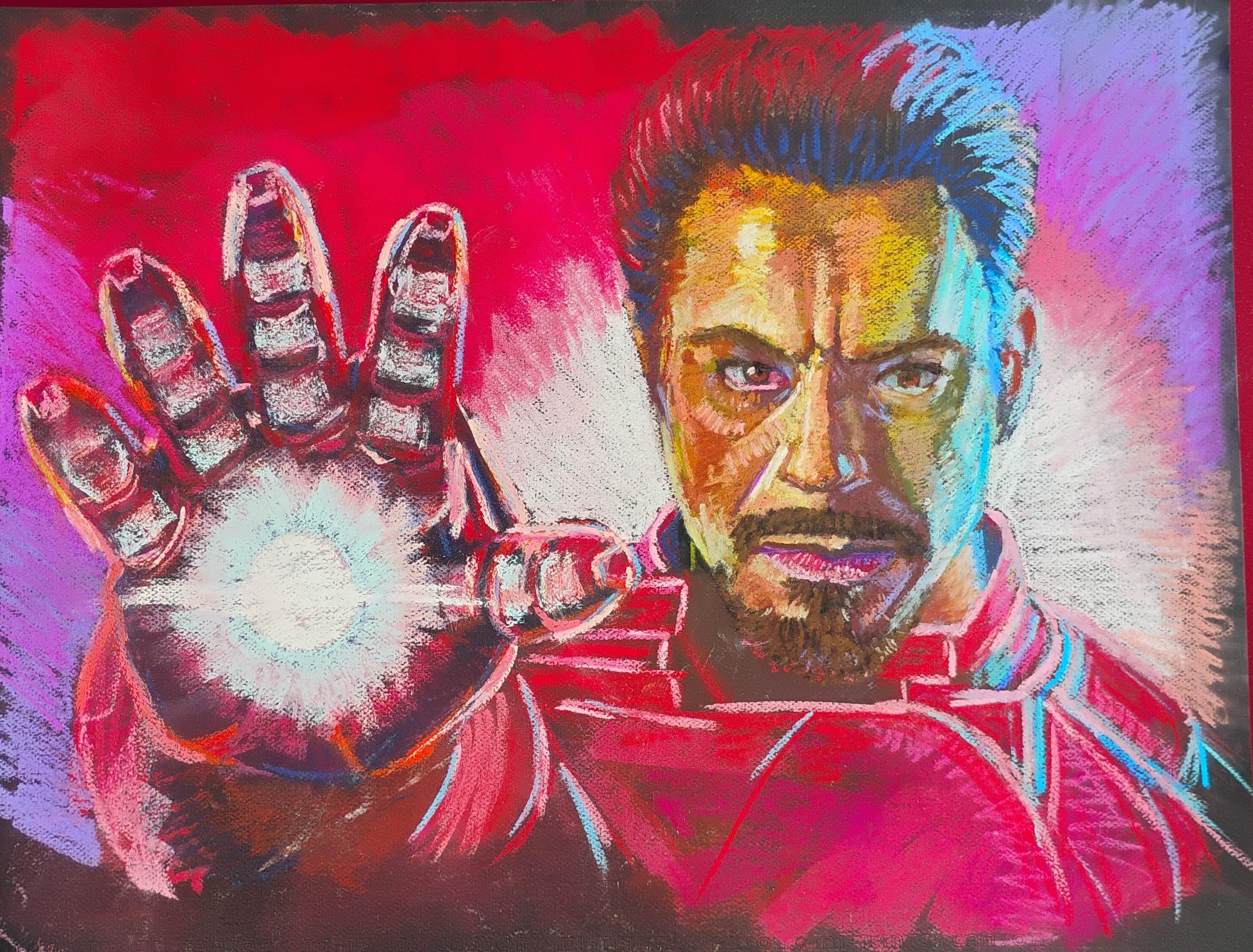
How off is his face? Having soft pastel issues lol. I know he has a weak right eye and a fat bottom lip so far
Commentaires
Jonathon_G2025-10-17 18:27
I think it looks great
x_victoire2025-10-17 18:29
it's recognizable enough to know it's supposed to be rdj, you're good
mBrooks-2025-10-17 18:33
I know nothing of painting but shouldn’t the lip dip thingy on the top lip, shouldn’t that line up under the middle of the nose? Cause it’s making the mouth look off centered to the left and drooping if that makes sense.
Regalrefuse2025-10-17 18:37
Seconded on that. Great drawing but the mouth needs to be shifted to the left
Leesburgcapsfan2025-10-17 18:43
Pilipino Tony Stark looks awesome. Good work man!
BuddhistChrist2025-10-17 21:35
Tony “Honeybear” Stark
elpajaroquemamais2025-10-17 18:49
Kirk Lazarus as Iron man
TimelyBlacksmith922025-10-17 19:53
Came to say this. Haha
TheOneWhoCared2025-10-17 20:30

bloodandglory312025-10-17 20:48
This!
RorrikTheGreatful2025-10-17 19:09
Looks great honestly very little feedback.
- Maybe clean up his moustache to be a little bit more even
- clean up the eye shape and colouring
you_matter_2025-10-17 19:10
Loks venezuelan, but great
MasterKingdomKey2025-10-17 19:25
Looks great! Just his eyes makes him look more like a Robert Down Syndrome Jr. But colors are awesome
Komaisnotsalty2025-10-17 19:56
He looks like he has Bell’s Palsy - the left side of his face is drooping.
The highlights and the bone ridges are off, and I think that’s what’s shifting his face.
The eye shape is very off for Caucasian/Italian too.
OuterSpiralHarm2025-10-17 20:24
He looks like a dude, playing a dude, disguised as another dude!
jhsounds2025-10-17 20:26
Hispanic Scott Baio
Comfortable_Breads2025-10-17 20:53
It looks like him but it’s not symmetrical
maeffjuhs2025-10-17 22:45
It looks better than anything I would ever be able to draw, good job OP.
If anything, I feel like his arm is too thick, or his fingers too short
RoseArtiste2025-10-17 23:36
As someone whose drawn rdj more times than I can count you’ve done a great job, only issue being his eyes tilt downwards a lot more at the ends
RoseArtiste2025-10-17 23:37
I’d also say as a general tip look at your art through a mirror as you work on it so it can come out abit more symmetrical
juances192025-10-18 04:11
I think it's more a problem of lack of symmetry? Either eye would be fine on it's own, the fact that they are different makes it feel odd.
saganakisamurai2025-10-18 04:16
This is VERY refreshing to see in a feed of AI art. Sick.
Craftyadhd2025-10-18 10:32
To help exaggerate the light on the right side I would darken the other shadows on the left side, it will allow our brains to more cohesively assume light and skin tone , if it helps do a small just color study on scrap paper and see if it helps it flow more , I would also add the skin is a lot of yellow but our skin is more a mix of yellow blue and red all together look for those colors and see if it helps you pull out some more details, I know pastels and skin can be really tricky , usually I like to do a color layer and then “ blend” my skin in together it usually makes that pop art exaggerated color style while staying true to the image and colors I want to trick the brain into seeing.
Great work I love the contrast of the blue and red ( I’m always a lover of seeing primary colors used in art and this is a great example !! )
Commentaires
- Maybe clean up his moustache to be a little bit more even
- clean up the eye shape and colouring
The highlights and the bone ridges are off, and I think that’s what’s shifting his face.
The eye shape is very off for Caucasian/Italian too.
If anything, I feel like his arm is too thick, or his fingers too short
Great work I love the contrast of the blue and red ( I’m always a lover of seeing primary colors used in art and this is a great example !! )